Overview
Leaders at Boston Scientific could usually get answers to their workforce questions — but it took days, sometimes weeks. The process involved submitting a request, waiting on an analyst, and often going back and forth before getting what they needed.
This project was about closing that gap. Not with new metrics — the data was already there — but by making it directly accessible to the people who needed it, at the moment they needed it.
I led UX strategy and design for the experience. The constraint that shaped everything: we were building in Tableau, within an enterprise environment, for thousands of leaders across radically different functions.
The Challenge
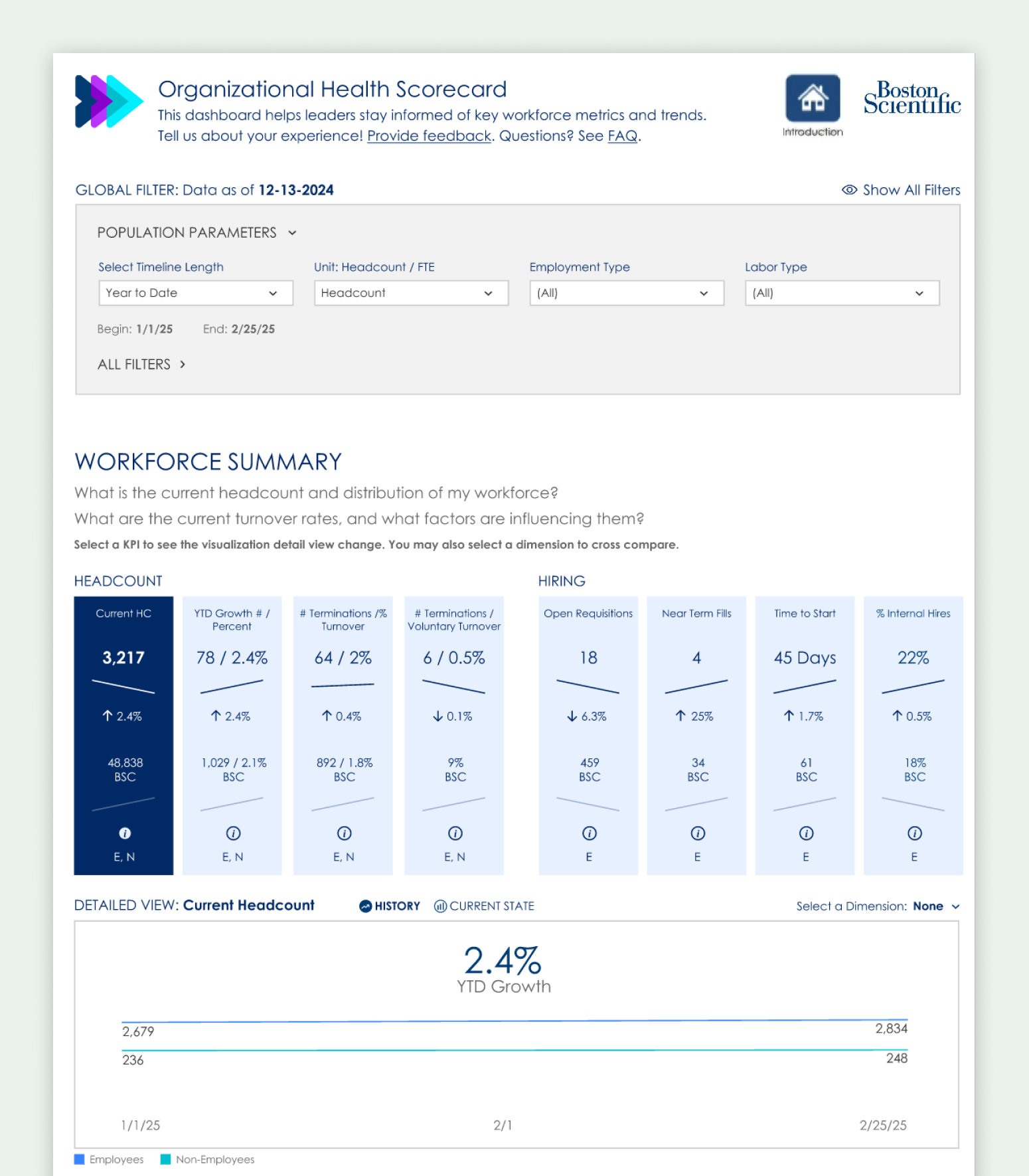
A workforce dashboard sounds simple until you think about who's actually using it.
Boston Scientific has leaders across R&D, manufacturing, commercial sales, IT, finance, facilities, and corporate functions — with team sizes ranging from a handful of direct reports to several thousand. What a plant operations director cares about on a Monday morning is genuinely different from what a regional sales leader or an HR business partner cares about.
The challenge wasn't defining the right metrics. It was designing something that could responsibly serve that entire range of people without being misleading, confusing, or just irrelevant.
- Usable without training or analyst support
- Quick to orient at a glance, with optional depth for those who want it
- Consistent across very different team sizes and leadership contexts
- Buildable within Tableau's constraints and the project's timeline
One leader put it directly during research: "This has to be simple enough that I can glance at it and walk into a meeting knowing what's going on."
Research & Sensemaking
I started with interviews across functions, regions, and levels — not to gather feature requests, but to understand how leaders actually get information today.
What they track closely. What takes effort to retrieve. What they don't see at all because it's never surfaced by default.
A consistent pattern: most leaders had a clear sense of what mattered to them. The friction wasn't comprehension — it was access. And the biggest blind spots weren't in the data leaders already watched. They were in the adjacent signals they never thought to ask about because getting them required too much effort.
That reframe shaped the design direction significantly. The primary job wasn't to teach leaders new things to care about. It was to reduce the cost of accessing what they already knew they needed.
Design Direction & Key Decisions
Designing for this kind of breadth required deliberate restraint.
The temptation in dashboard design — especially with a sophisticated analytics team behind it — is to include more. More metrics, more context, more configurability. But for a dashboard serving thousands of leaders across very different contexts, that impulse works against the product.
- Design for the 80%, not the edge case. Capture most of the value for most leaders, most of the time. Accept that no single dashboard will be perfectly relevant to everyone.
- Reduce access friction above all. The primary UX opportunity wasn't novel visualization — it was making existing information fast and effortless to surface.
- Choose signals carefully. Every metric included was evaluated not just for relevance but for safety — could it be easily misread? Could it lead someone to the wrong conclusion without context?
- Progressive disclosure. A calm, glanceable entry point with optional depth for those who want to explore further. Most leaders shouldn't need to dig.
- Neutral framing. Language and layout intentionally non-prescriptive — surfacing information without telling leaders what to think about it.
These decisions were less about visual design and more about responsible information architecture at scale.
What Launch Taught Us
The dashboard launched to a population of several hundred leaders. Initial uptake was real but shallow: roughly a quarter of the leader population explored it in the first two weeks — and then usage settled into a small daily core rather than a broad habit.
It would be easy to write that off as a marketing problem, and awareness was certainly part of it — the launch was quiet by design. But the more interesting hypothesis is about workflows: a dashboard only earns a place in a leader's week if it attaches to a moment where a decision actually happens. Glanceable isn't the same as necessary.
That's the current phase of the work: research with leaders who tried it and didn't return, to understand whether the gap is awareness, relevance, or workflow fit — and redesigning how the dashboard shows up in existing rhythms (leadership meetings, planning cycles, HR conversations) rather than waiting to be visited.
Adoption is a design problem, not a launch checkbox. This project is teaching me more about that than any success story would.
Reflection
This project reinforced something I keep running into in enterprise work: clarity doesn't come from adding more data. It comes from making deliberate choices about what to surface and how.
Dashboards are not neutral. As Drucker famously put it, "what gets measured gets managed." Every metric you include shapes what people notice, what gets discussed, and what gets acted on — especially under time pressure. That's not a reason to avoid dashboards, but it is a reason to take the design of them seriously.
Designing responsibly at this scale meant prioritizing judgment and restraint over completeness. What you leave out matters as much as what you include. And launch made the lesson concrete: access alone doesn't change behavior — relevance inside real workflows does.